
What if the complex graphs on your dashboard could speak to you with the clarity of a personal physician? Whilst we've never had more access to our biology, many of us feel increasingly lost in a sea of percentages and fluctuating lines. It's exhausting to stare at a screen, wondering if a sudden dip in your metrics signifies a genuine health risk or merely the result of a late dinner. Mastering the art of interpreting health data charts is the bridge between this data-induced anxiety and true physiological intelligence. It's about moving beyond raw numbers to understand the unique, rhythmic patterns of your own body.
You deserve to feel in control of your wellness journey, not intimidated by it. This guide will teach you how to transform confusing biometric graphs into actionable insights using modern health data visualisation tools. We'll examine how to distinguish normal daily variations from significant trends; this ensures you can identify health deviations before symptoms ever appear. By the end, you'll have the confidence to use platforms like the Cura+ AI Platform to navigate your data with clinical precision, turning every chart into a strategic advantage for your long-term vitality.
Key Takeaways
- Define your unique biological baseline to move beyond misleading "average" metrics and achieve true physiological intelligence.
- Gain confidence in interpreting health data charts by selecting the specific visualisation tools that best track temporal changes in your vital biomarkers.
- Implement a rigorous five-step framework designed to help you prioritise long-term trends over confusing daily fluctuations.
- Learn to identify meaningful physiological deviations, allowing you to recognise potential health shifts before physical symptoms manifest.
- Understand how the Cura+ AI Platform and theBand collaborate to translate complex biometric graphs into clear, actionable wellness strategies.
The Shift from Raw Data to Physiological Intelligence
Traditionally, health monitoring was a reactive discipline. You felt a symptom, visited a clinic, and received a snapshot of your state. In 2026, we've moved toward Physiological Intelligence. This is the sophisticated ability to understand your body’s unique baseline. It represents a transition from viewing raw numbers to perceiving the narrative of your biology. Mastery in interpreting health data charts allows you to see past the noise of daily fluctuations to find the signals that truly matter. It's the difference between managing a crisis and optimising a system.
Most traditional benchmarks are based on population averages. However, "average" is often a misleading metric for the individual. Your resting heart rate might be ten beats higher than the norm, yet perfectly healthy for your specific physiology. Modern AI now acts as a precise filter, removing the "noise" of daily life, such as a single night of poor sleep or a temporary spike in caffeine, to reveal the significant health signals underneath. This predictive model allows for interventions before a health issue becomes a clinical problem, replacing guesswork with data-driven certainty.
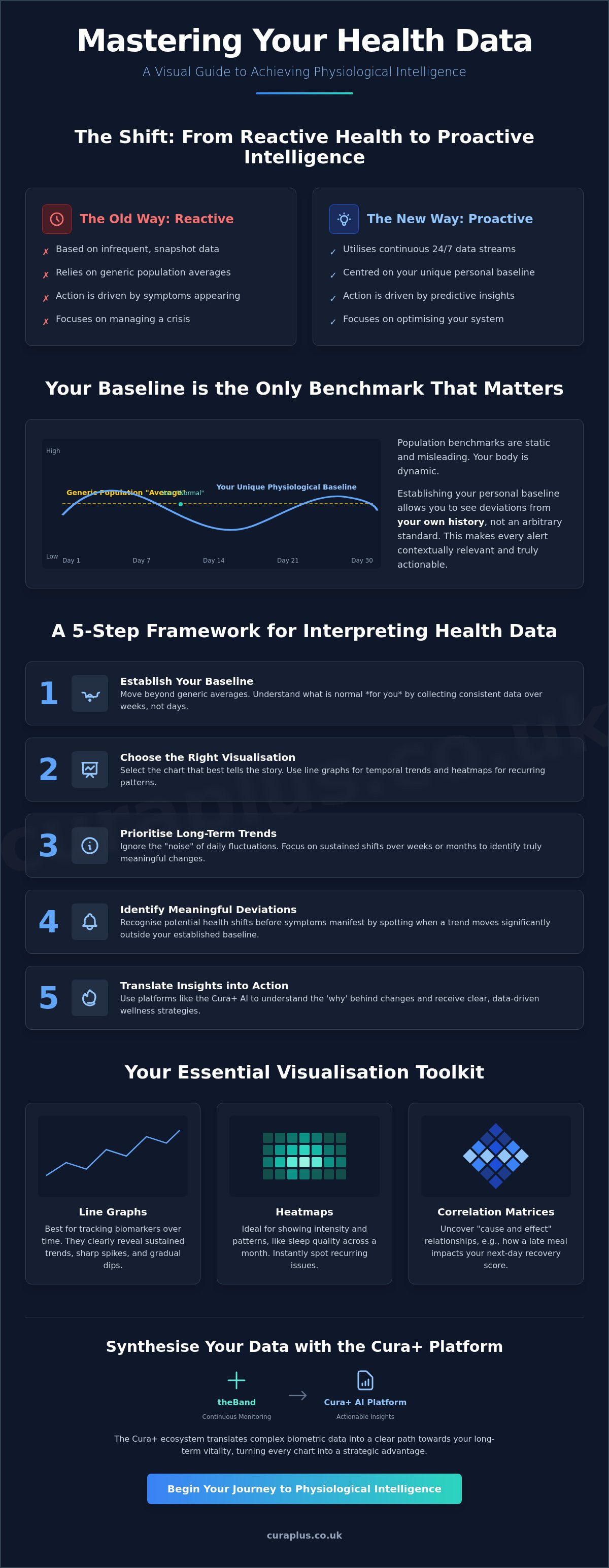
Why Baselines Matter More Than Benchmarks
Your unique "normal" is the only metric that truly counts in a high-performance wellness strategy. Benchmarks are static, but your body is dynamic. Understanding how to build a health baseline is the first step in this journey. Factors such as age, lifestyle, and genetics shift the centre of your data charts. What was normal for you at twenty is rarely the same at forty. When you're interpreting health data charts, you're looking for deviations from your own history rather than an arbitrary standard. By establishing a baseline, you ensure that every alert you receive is contextually relevant to your history, not a generic population standard.
The Role of Continuous Monitoring
Periodic spot-checks are fundamentally flawed. They fail to capture the intricate story of your nervous system and how it responds to stress, recovery, and environment. True physiological intelligence requires 24/7 data collection to ensure accurate trend visualisation. This continuous stream creates what we call "digital biomarkers", which are objective, quantifiable data points collected via sensors that reflect your internal health status. Effective data and information visualization is what makes these constant streams of information digestible. It allows you to see the "big picture" of your health without becoming overwhelmed by the minute-by-minute fluctuations that define the human experience.
Essential Health Data Visualisation Tools and Chart Types
To achieve true physiological intelligence, one must look beyond the static bar charts of the past. Modern wellness platforms utilise a suite of sophisticated visualisations designed to reveal the subtle interplay between your lifestyle and your biology. Whilst basic apps might offer a simple summary, professional-grade tools rely on line charts, heatmaps, and correlation matrices to provide a granular view of your internal state. Effective interpreting health data charts requires an understanding of these specific formats to ensure you aren't misreading a temporary fluctuation as a permanent shift.
The Agency for Healthcare Research and Quality offers established guidelines for interpreting health charts that stress the importance of clarity and user-centred design. In 2026, these principles are applied to complex biomarkers like Heart Rate Variability (HRV) and glucose trends. Correlation matrices, for instance, are now essential for understanding how specific stressors, such as a high-intensity workout or a late-night meal, directly impact your recovery metrics the following morning. By interpreting health data charts through this lens, you move from passive observation to active system management.
Line Graphs: Tracking the Journey of Your Biomarkers
Line graphs remain the gold standard for tracking temporal changes in your physiology. In a wellness context, the x-axis typically represents time (days, weeks, or months), whilst the y-axis measures intensity or frequency, such as resting heart rate or respiratory rate. It's vital to distinguish between a "spike"—a sharp, one-off increase—and a "sustained trend" that indicates a genuine shift in your physiological baseline. A moving average serves as a mathematical tool that averages data points over a specific period to smooth out daily fluctuations and highlight the underlying direction of your health. If you are looking for a device that automates this complex analysis, exploring theBand can provide the continuous stream of data necessary for these high-fidelity visualisations.
Heatmaps and Distribution Charts
Heatmaps offer a different perspective by using colour intensity to represent data density or magnitude. These are particularly effective for spotting irregularities in skin temperature or identifying disruptions in your circadian rhythm. For example, a deep blue hue might indicate restorative deep sleep, whilst a shift toward warmer colours could signal restlessness or an elevated nocturnal temperature. Distribution charts complement this by showing where your data points fall relative to your "readiness" zones. Visualising your sleep stages over a 30-day period through these charts allows you to identify patterns that a single night's data would miss, providing the clarity needed to make informed lifestyle adjustments.
A 5-Step Framework for Interpreting Health Data Charts
Understanding your biology shouldn't require a degree in statistics. Whilst some clinical models rely on complex rules for trend identification, a simplified logic allows you to extract value without the cognitive load. Interpreting health data charts is most effective when you adopt a top-down approach. You must observe the "big picture" before zooming into granular daily statistics. This methodical progression ensures that you don't mistake a single night of poor sleep for a systemic health failure. By using AI-generated summaries to validate your own observations, you create a feedback loop that refines your physiological intuition over time.
The following steps provide a structured pathway to clarity, moving from broad temporal contexts to specific biomarker correlations. This framework prioritises long-term stability over short-term volatility, ensuring your wellness decisions are based on evidence rather than impulse.
Step 1: Define Your Timeframe
Viewing your data in weekly or monthly blocks is the most effective way to reduce "data noise". Single-day fluctuations are often the result of transient environmental factors rather than genuine biological shifts. Over-analysing these brief dips can lead to unnecessary anxiety. Instead, set the context for your current lifestyle phase, whether you're in a period of intense training, professional stress, or active recovery. This longitudinal perspective transforms a chaotic scatter plot into a legible narrative of your health journey.
Step 2: Identify the Baseline Shift
Once you've established a timeframe, look for a "new normal" in your resting metrics. A baseline shift indicates that your body has fundamentally adapted to a new stressor or lifestyle change. For instance, a sustained increase in your deep sleep duration over three weeks suggests a successful adaptation to a new evening routine. Comparing today’s data to your historical average is the only way to confirm if a change is meaningful. Without this context, you're merely looking at numbers in a vacuum. It's the trend, not the individual data point, that defines your progress.
Step 3: Cross-Reference Biomarkers
Isolation is the enemy of accuracy. A drop in Heart Rate Variability (HRV) might be concerning on its own, but when combined with a rise in nocturnal skin temperature, it becomes a high-fidelity signal of an impending immune response. Understanding the synergy between movement, nutrition, and recovery charts is essential for a holistic view. Many AI algorithms for health prediction now automate this cross-referencing step, highlighting correlations that the human eye might miss. This integration allows you to see how a specific dietary choice on Tuesday directly influences your readiness score on Wednesday, creating a truly predictive model of wellness.
Recognising Deviations: When a Trend Becomes an Alert
The most common anxiety amongst those interpreting health data charts is the fear of misreading a signal. "How do I know if I should be worried?" is a valid question in an era of data abundance. In the context of predictive health, a meaningful deviation isn't just a random outlier or a technical error. It's a statistically significant departure from your established baseline that persists across multiple biomarkers. Unlike the simplistic threshold alarms of the past, which triggered whenever a heart rate crossed an arbitrary number, modern AI alerts are context-aware. They understand that a high heart rate during a sprint is normal, whilst an elevated resting heart rate during sleep is a signal that requires attention.
This sophisticated approach allows for viral onset detection. Your body often knows it's fighting an infection long before you feel the first scratch in your throat or a heavy head. By monitoring subtle shifts in your internal environment, the Cura+ AI Platform identifies these early warning signs. This proactive model replaces the "wait and see" approach with a "detect and protect" strategy. It turns your data into a defensive shield, providing the clarity needed to intervene before your wellness is compromised.
The Anatomy of a Health Alert
Distinguishing between a lifestyle-induced dip and a genuine physiological warning is critical for maintaining calm control. A lifestyle dip might follow a celebratory dinner or a long-haul flight; these are expected and usually resolve within forty-eight hours. However, a physiological warning is more complex. theBand monitors over 15 distinct biomarkers simultaneously to confirm a deviation. A 10% shift in baseline HRV often precedes physical symptoms of illness. When this shift is cross-referenced with a rise in respiratory rate and a decrease in sleep efficiency, the system generates a high-fidelity alert. This multi-layered verification ensures that you only receive notifications that are truly actionable.
Actionable Responses to Data Shifts
Once a deviation is identified, the next step is decisive action. Your "readiness" chart serves as a biological green light or a cautionary yellow. If your data suggests a significant strain, it's time to prioritise rest. Many high-performers find it difficult to justify a "down day" to themselves or their coaches. Using objective data provides the logical evidence needed to step back without guilt. You can further refine your response by accessing personalised health coaching app resources, which offer specific protocols for recovery based on your current data trends. If you're ready to move from observation to optimisation, explore the Cura+ AI Platform to receive high-fidelity alerts tailored to your unique biology.
Synthesising Insights with the Cura+ Dashboard
Data without interpretation is merely noise. Whilst the previous sections have equipped you with the logic for interpreting health data charts, the final step in your journey toward physiological intelligence is the synthesis of these metrics into a coherent strategy. theBand by Cura+ serves as the essential engine for this process, acting as a high-fidelity data collection tool that operates silently in the background of your life. It captures a continuous stream of biological signals, ensuring that the visualisations you see are built upon a foundation of absolute accuracy rather than intermittent snapshots.
The Cura+ AI Platform acts as the sophisticated translator for this raw information. It moves beyond the traditional display of numbers, instead presenting your data in an elegant interface that tracks over 15 critical biomarkers simultaneously. This integration is vital for interpreting health data charts with speed and precision. By consolidating heart rate variability, glucose trends, and inflammation risk into a single dashboard, the platform allows you to see the interconnectedness of your systems. It replaces the confusion of multiple apps with a unified vision of your internal state, inviting you to move from merely watching graphs to mastering your own wellness.
From Visualisation to Personalised Strategy
The true power of a modern health dashboard lies in its ability to offer specific, actionable adjustments based on your unique data. Our AI-driven system functions like a high-level consultant for your body, providing insights that are tailored to your historical baseline. If your recovery metrics suggest a systemic strain, the dashboard doesn't just show a red line; it offers a specific path forward. This is where the AI health and wellness coach functionality becomes indispensable. It translates complex biometric fluctuations into plain-English intelligence, suggesting whether you should prioritise metabolic rest or if you're in a prime state for peak physical performance.
The Future of Your Health Data
Owning your health narrative requires a long-term perspective that transcends daily stats. Through methodical trend analysis, the Cura+ AI Platform enables you to predict your biological peak, identifying the specific conditions under which your body performs at its best. theBand empowers you to take full command of this narrative, providing the methodical reliability needed to plan your wellness years in advance. This is the ultimate expression of physiological intelligence: the ability to navigate your future with clarity and confidence. If you're ready to transcend the limitations of traditional tracking and embrace a data-driven future, we invite you to join the pre-launch for theBand and secure your place at the forefront of the predictive wellness revolution.
Mastering Your Biological Narrative
The journey towards true physiological intelligence begins with a fundamental shift in perspective. You've moved beyond the passive observation of numbers to the active mastery of your own biological systems. By establishing a unique baseline and applying a rigorous framework for interpreting health data charts, you've replaced uncertainty with clinical clarity. You now possess the tools to recognise meaningful deviations long before they manifest as physical symptoms, allowing you to intervene with precision. This proactive approach ensures you're always one step ahead of your health, transforming data into a strategic asset for longevity.
The future of your wellness isn't a series of guesses; it's a data-driven strategy tailored to your specific biology. With theBand, you can monitor 15+ complex biomarkers in real-time, receiving AI-driven predictive alerts designed specifically for British health optimisation standards. It's the ultimate tool for those who refuse to settle for "average" health metrics. Take the decisive step from watching graphs to mastering your vitality.
Discover theBand by Cura+: Your Gateway to Predictive Health Intelligence
Your path to self-optimisation is now clear. Step into the era of predictive wellness and let your data guide you to peak vitality with absolute confidence.
Frequently Asked Questions
What are the most important health data visualisation tools for beginners?
Beginners should prioritise line charts and heatmaps as their primary visualisation tools. Line charts provide a clear view of temporal shifts in resting heart rate or sleep duration, making it easy to spot progress. Heatmaps are excellent for identifying broader behavioural patterns, such as inconsistencies in your sleep schedule or activity levels throughout the week. These tools simplify complex data into legible, actionable insights.
How do I know if a spike in my heart rate chart is normal or a cause for concern?
Contextual analysis is the key to determining if a heart rate spike is a cause for concern. A spike during vigorous exercise or a stressful meeting is a normal physiological response. However, an unexplained spike whilst you are at rest or asleep, especially if it persists, signals a deviation from your baseline. You should look for corresponding shifts in other biomarkers to confirm if your body is under genuine strain.
Can health charts really predict if I am going to get a cold or flu?
Predictive health charts can identify the early physiological signs of an impending infection before physical symptoms manifest. By interpreting health data charts that show a simultaneous drop in Heart Rate Variability (HRV) and a rise in nocturnal skin temperature, the Cura+ AI Platform can detect viral onset. This allows you to prioritise rest and recovery before the illness fully develops, potentially reducing its severity.
Is it better to look at my health data daily or weekly?
Weekly reviews are superior for identifying long-term trends, whilst daily checks are useful for assessing immediate readiness. Over-analysing daily data can lead to unnecessary anxiety over minor, normal fluctuations. A weekly perspective provides the necessary distance to see the big picture of your physiological adaptation. It ensures that your wellness decisions are based on sustained evidence rather than transient biological noise.
What is the difference between a fitness tracker and a predictive health wearable?
A fitness tracker primarily records past actions, such as steps taken or calories burned, whereas a predictive health wearable like theBand focuses on your future biological state. Predictive wearables monitor complex biomarkers to forecast recovery and potential health risks. They move beyond simple activity logging to provide sophisticated physiological intelligence, acting as a proactive consultant for your body rather than a passive recorder.
How does HRV (Heart Rate Variability) look on a health chart?
HRV is typically displayed as a line graph where higher values indicate a robust, well-recovered nervous system. On a sophisticated dashboard, you might also see it as a distribution plot that shows your current HRV relative to your historical baseline. A consistent downward trend in this chart is a clear signal that your body is under excessive strain. Monitoring these shifts allows you to adjust your training intensity accordingly.
Can I share my health data charts with my GP or personal trainer?
Sharing your charts with health professionals is highly recommended to facilitate precision care and personalised training. These visualisations provide your GP or trainer with objective data that supplements your subjective reports. It ensures that your medical or fitness strategy is based on actual physiological evidence. This collaborative approach allows for more accurate adjustments to your lifestyle protocols, leading to superior health outcomes.
What should I do if my health dashboard shows a consistent downward trend in recovery?
A consistent downward trend in recovery requires an immediate shift in your lifestyle priorities. You should reduce training intensity, optimise your sleep hygiene, and review recent stressors. Interpreting health data charts correctly means acting on these signals by using the Cura+ AI Platform to identify which specific factors are hindering your recovery. This proactive response prevents minor strain from escalating into chronic fatigue or injury.


